Artificial intelligence (AI) has evolved rapidly over the past decade, moving from simple data-processing tasks to sophisticated deep-learning capabilities. A crucial development along this path is the emergence of multimodal systems, which combine several types of data — text, images, audio and video — to provide more robust and versatile solutions. This advance is more than technological window dressing: it represents a qualitative leap towards emulating human cognition in machines.
In this essentially practical article, we want to explore, through some concrete examples, what is probably the most powerful multimodal tool currently available to the general public: GPT-4 V(ision).
This advanced version of the GPT-4 language model adds the ability to “see” and interpret images. Here, we will explore practical examples of how GPT-4 Vision can be applied in politics, offering new perspectives and tools for political communication and marketing, just as it is being used in highly creative and surprising ways in many other contexts. Bear in mind that we are looking at the “six-month-old baby” version of this multimodal technology, which will undoubtedly advance rapidly and powerfully over the coming years. Yet what is already here — the way GPT-4 can now “see”, interpret and work with images, even though its novelty means we do not yet know how to give it the most precise instructions, or prompts — is already very interesting.
Our own examples of GPT-4 V in political practice
What follows reproduces the requests to the AI and its unedited responses. We have included the responses as text rather than images to make them easier to read.
English edition note: the prompts and model responses below are historical examples recorded in the Spanish article published on 18 October 2023. They are translated in full here, including prompts transcribed from the screenshots. The quoted responses reproduce the model's assessments and recommendations at that time; they are not new advice or independently verified findings.
Example 1: analysing election posters
In this case, the posters are from Spain's July 2023 general election.
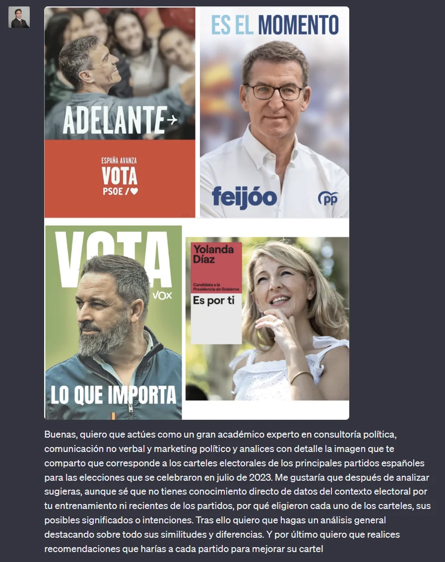
Original screenshot, retained in Spanish. The four main slogans are translated in the response below. Additional poster text reads “Spain moves forward”, “Vote PSOE”, “Vote VOX”, and “Yolanda Díaz — candidate for prime minister”.
Historical prompt — translated from the screenshot:
Hello, I want you to act as a leading academic expert in political consulting, non-verbal communication and political marketing, and analyse in detail the image I am sharing with you, which shows the election posters of the main Spanish parties for the elections held in July 2023. After analysing it, I would like you to suggest — although I know that, because of your training, you have no direct knowledge of the electoral context or recent information about the parties — why they chose each of the posters, and their possible meanings or intentions. Then I want you to give a general analysis, highlighting similarities and differences above all. Finally, I want you to make recommendations to each party on how to improve its poster.
Historical GPT-4 Vision response — translated from the Spanish article:
To begin, let us remember that analysing election posters involves various components, from visual design, colour choices and the candidate's body language and non-verbal communication to the use of keywords and slogans. These elements are not chosen at random: they seek to convey a specific message to the electorate. Below is a detailed analysis of each poster:
1. PSOE — “ADELANTE” (“FORWARD”)
- Visual design: an image of the candidate surrounded by a group of people, smiling and looking ahead.
- Colours: predominantly red, traditionally associated with PSOE.
- Non-verbal communication: the candidate is smiling, conveying optimism and closeness to citizens.
- Slogan: “FORWARD” suggests progress and movement towards the future.
- Analysis: the message appears to be one of continuity and progress, with a focus on unity and inclusion.
2. PP — “ES EL MOMENTO” (“NOW IS THE TIME”)
- Visual design: a close-up of the candidate with a serious, determined expression.
- Colours: blue, PP's traditional colour.
- Non-verbal communication: looking directly at the viewer, which can be interpreted as confidence and determination.
- Slogan: “NOW IS THE TIME” conveys urgency and the idea of a necessary change.
- Analysis: the poster projects a message of strong leadership, reliability and the need for change.
3. VOX — “LO QUE IMPORTA” (“WHAT MATTERS”)
- Visual design: a close-up image of the candidate with a serious, thoughtful expression.
- Colours: green, VOX's identifying colour.
- Non-verbal communication: a reflective, profound expression.
- Slogan: “WHAT MATTERS” suggests focusing on essential or urgent issues.
- Analysis: it conveys a message about priorities, probably related to the central issues of VOX's campaign.
4. Yolanda Díaz — “Es por ti” (“It's for you”)
- Visual design: an image of the candidate smiling, with a friendly, approachable expression.
- Colours: pink and white, conveying femininity and purity.
- Non-verbal communication: an upward gaze, which may suggest hope or vision.
- Slogan: “It's for you” suggests an approach centred on the citizen.
- Analysis: the focus is on closeness to the electorate, suggesting that proposals and actions are directed towards citizens' wellbeing.
Similarities and differences
- Similarities: all the posters use close-ups of the candidates, suggesting a focus on personal leadership.
- Differences: while some posters opt for more serious expressions (PP and VOX), others convey optimism and closeness (PSOE and Yolanda Díaz). The slogans also differ in emphasis, from progress (PSOE) to urgency (PP) and priorities (VOX).
Recommendations
- PSOE: maintain the focus on unity and inclusion, but consider adding elements that highlight concrete proposals.
- PP: humanise the candidate further, perhaps by showing interactions with citizens or presenting proposals visually.
- VOX: clarify which issues are “WHAT MATTERS”, offering a more detailed view of its priorities.
- Yolanda Díaz: focus on specific proposals that support the slogan “It's for you”, showing how they will affect the electorate's everyday lives.
In conclusion, election posters seek not only to inform but also to stir emotions and connect with the electorate. Every design element must align with the central message the party wishes to convey.
Example 2: analysing an image of a website
We chose Obama's website from 2012 because it is particularly iconic in digital political marketing.
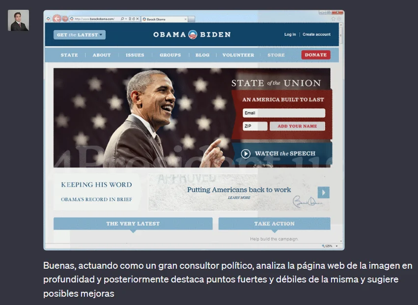
Original screenshot. The campaign website's text is already in English; the Spanish prompt is translated below.
Historical prompt — translated from the screenshot:
Hello, acting as a leading political consultant, analyse the website in the image in depth, then highlight its strengths and weaknesses and suggest possible improvements.
Historical GPT-4 Vision response — translated from the Spanish article:
Detailed analysis of Barack Obama's campaign website
Visual elements and design
- Header: the “OBAMA BIDEN” logo is prominent, alongside the menu options (STATE, ABOUT, ISSUES, etc.). This immediately identifies the main candidates.
- Imagery: the main photograph shows Barack Obama, smiling and energetic, in front of a series of American flags. It is a powerful image intended to evoke patriotism and leadership.
- Calls to action (CTAs): there is a clear CTA to watch the “STATE of the UNION” and another to “DONATE”. The aim is to mobilise the audience both to engage with information and to contribute financially.
- Tone and messages: “KEEPING HIS WORD” and “Putting Americans back to work” are central messages, emphasising Obama's reliability and commitment to employment.
Strengths
- Patriotic imagery: the combination of Obama's image and the flags evokes strong patriotic feelings.
- Clear CTAs: the calls to action are clear and prominent.
- Consistent messages: the emphasis is on Obama's reliability and commitment to central issues such as employment.
Weaknesses
- Information overload: the page appears to contain a great deal of content in a small space. This may overwhelm some visitors.
- Lack of multimedia: although there is a CTA to watch a speech, embedding videos directly on the homepage could be more engaging.
- Localisation: there is no indication of content adapted for non-English speakers or different regions.
Suggestions for improvement
- Simplify and optimise: consider a cleaner, mobile-friendly layout, given that many users might access it on mobile devices.
- Include testimonials: presenting voter testimonials could further humanise the campaign and connect emotionally with visitors.
- Improve accessibility: ensure that the site is accessible to people with disabilities, and consider translation options or regionalised content.
- Integrate social media: incorporate live feeds from the campaign's social media accounts to show activity and updates in real time.
In conclusion, while the website effectively captures the spirit and key messages of Barack Obama's campaign, there are opportunities to improve the user experience, accessibility and integration of modern media. Political campaigns must remain agile and adapt their digital strategies to current trends and their audiences' needs.
Example 3: image and clothing advice for a prospective candidate
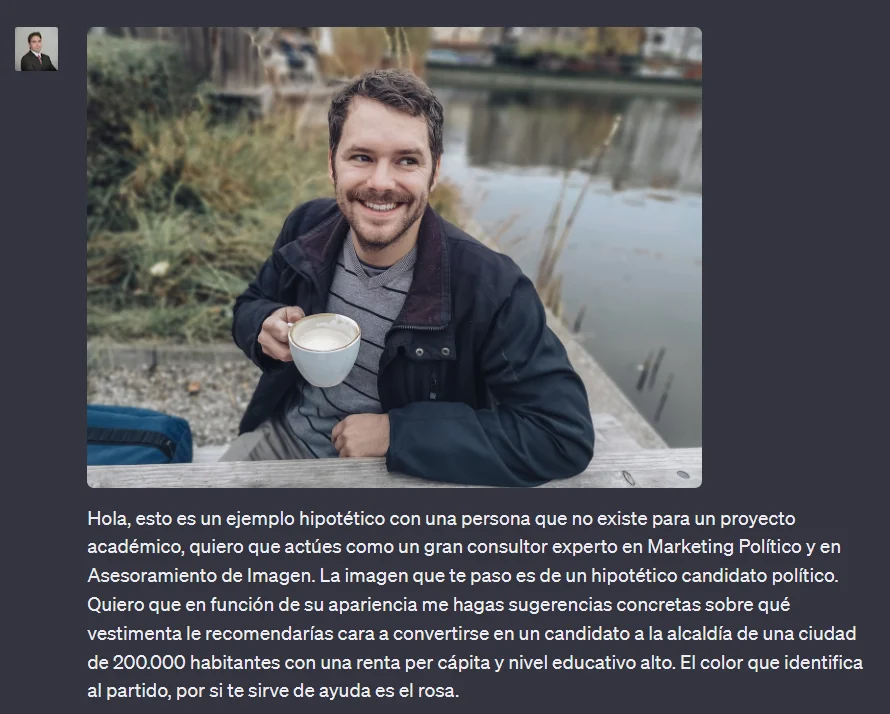
Original screenshot, with the full Spanish prompt translated below.
Historical prompt — translated from the screenshot:
Hello, this is a hypothetical example involving a person who does not exist, for an academic project. I want you to act as a leading consultant specialising in political marketing and image consultancy. The image I am sending you is of a hypothetical political candidate. Based on his appearance, I want you to give me concrete suggestions about the clothing you would recommend for him to become a mayoral candidate in a city of 200,000 inhabitants with high per capita income and a high level of education. The party's identifying colour, if it helps, is pink.
Historical GPT-4 Vision response — translated from the Spanish article:
Understood, Fernando. Let us address this step by step, taking the context provided into account:
1. The city and its audience: a city of 200,000 inhabitants with high per capita income and a high level of education suggests an informed population with high expectations of its political representation. The candidate's image should convey confidence and professionalism, and align with this electorate's values and aspirations.
2. Initial analysis of the candidate's appearance: at first glance, the person in the image looks friendly and approachable. His smile is genuine, and his casual appearance suggests closeness to people. However, for a political campaign in the city described, he must also convey seriousness and professionalism.
3. Clothing suggestions
- Suit: a modern, fitted suit in neutral tones such as grey or navy blue would be ideal. These colours convey professionalism and confidence. The suit must fit well to create a polished appearance.
- Shirt: a white shirt is a classic choice that always works well in formal settings. To incorporate the party's colour, however, you could opt for a pale pink shirt, which would be subtle and stylish.
- Tie: depending on the formality of the event or situation, a tie could be optional. If he chooses to wear one, it could be in shades of pink matching the party's colour, or in neutral tones complementing the shirt and suit.
- Accessories: an elegant, understated watch and cufflinks can add a touch of sophistication. It would be wise to avoid accessories that are too conspicuous or could distract from his political message.
- Shoes: well-polished formal shoes in dark colours, such as black or dark brown, are essential. They reflect attention to detail and professionalism.
4. General considerations
- Hair and beard: his hair and beard should be well groomed. If he decides to keep the beard, it should be trimmed and tidy.
- Posture and body language: beyond clothing, the candidate must maintain an upright posture and open body language, signalling confidence and approachability.
Finally, it is essential to remember that clothing is only one part of an overall image. Character, policies, communication and a genuine connection with voters are equally, if not more, important. Clothing should complement and reinforce these qualities rather than overshadow them.
These are just three examples — we will very probably explore further uses of GPT-4V and other applications of its multimodality in this newsletter, such as the very interesting voice interface that has also just been introduced — of how multimodality can further broaden the uses of a large language model such as GPT-4, continuing to completely transform how people work, in this case in political consulting and communication.
Fernando Nieto Lobato
Director of Digital Innovation, Institución Educativa ALEPH
Cite this essay
Fernando Nieto Lobato. “AI's new frontier: multimodality and its applications in politics — GPT-4 V(ision).” estrategIA, issue 003, 18 October 2023. English edition, 29 September 2026. https://elcontemplador.github.io/estrategia-english/essays/003/